Fixing Unstable Y-axis Range in Matplotlib Multi-scale Data Visualization
Fixing Unstable Y-axis Range in Matplotlib Multi-scale Data Visualization
Project Structure
1
2
3
4
5
6
7
8
9
10
11
32shot_fewshot/
├── 32shot_fewshot_origin_circle_scale_3.0/
│   ├── output/
│   │   ├── detection_results_2024_11_06_08_05_57.csv
│   │   ├── detection_results_2024_11_07_06_49_11.csv
│   │   └── ...
│   ├── train/
│   ├── val/
│   └── model_checkpoints/
├── 32shot_fewshot_origin_circle_scale_3.1/
└── ...
The Challenge
When dealing with multiple scale experiments:
- Each scale folder contains multiple CSV files with detection results
- Need to compare performance across different scales
- Visualization issues with y-axis stability
- Data type inconsistencies affecting plot reliability
Solution Implementation
1. Data Loading and Processing
1
2
3
4
5
6
7
8
9
10
11
12
13
14
15
16
17
18
19
def load_scale_results(base_path):
    """
    Load first detection results from each scale folder
    """
    scale_results = []
    scale_folders = glob.glob(os.path.join(base_path, "*scale*"))

    for folder in scale_folders:
        scale = float(re.search(r'scale_(\d+\.\d+)', folder).group(1))
        csv_files = glob.glob(os.path.join(folder, "output", "*.csv"))

        if csv_files:
            df = pd.read_csv(csv_files[0])
            scale_results.append({
                'scale': scale,
                'data': df
            })

    return sorted(scale_results, key=lambda x: x['scale'])
2. Visualization with Stable Y-axis
1
2
3
4
5
6
7
8
9
10
11
12
13
14
15
16
17
18
19
20
21
22
23
24
25
26
27
28
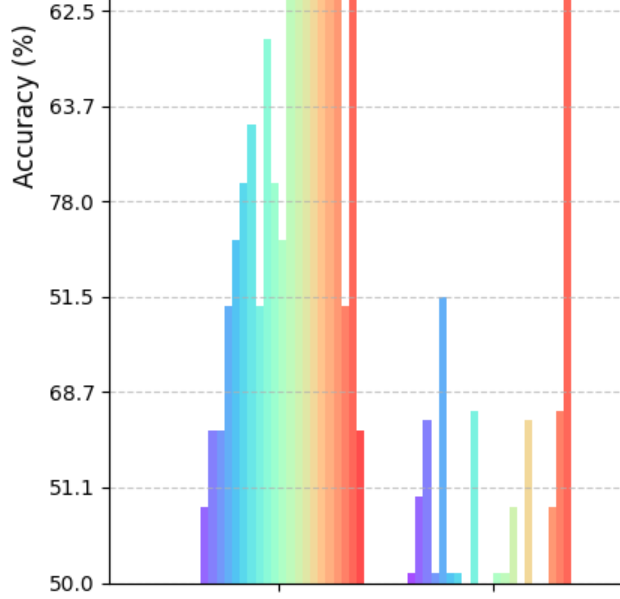
def plot_scale_comparison(scale_results, methods):
plt.figure(figsize=(15, 8))
# Fix y-axis range first
plt.ylim(0, 100)
colors = plt.cm.rainbow(np.linspace(0, 1, len(scale_results)))
x = np.arange(len(methods))
width = 0.8 / len(scale_results)
for idx, data in enumerate(scale_results):
scale = data['scale']
# Ensure numeric conversion
accuracies = pd.to_numeric(data['data']['acc'][1:9])
x_pos = x - (0.4 - width/2) + (idx * width)
plt.bar(x_pos, accuracies, width,
label=f'Scale {scale}',
color=colors[idx],
alpha=0.7)
plt.xlabel('Methods', fontsize=12)
plt.ylabel('Accuracy (%)', fontsize=12)
plt.title('Model Performance Across Different Scales')
plt.xticks(x, methods, rotation=45)
plt.legend(bbox_to_anchor=(1.05, 1))
plt.grid(axis='y', linestyle='--', alpha=0.7)
plt.tight_layout()
Key Learnings
- Data Type Consistency
- Always convert string data to numeric using
pd.to_numeric() - Handle missing values appropriately
- Always convert string data to numeric using
- Plot Stability
- Set y-axis limits before plotting
- Use consistent color schemes
- Proper layout management
- Best Practices
- Fix axis ranges early in the plotting process
- Use
plt.ylim()before creating plots - Ensure data types are numeric before visualization
- Apply
tight_layout()for better spacing
This post is licensed under CC BY 4.0 by the author.