[Troubleshooting] PlantUML Diagram Layout Optimization: From Grid to Vertical Stack
Introduction
When documenting API test scenarios, the primary goal is to visualize complex interactions at a glance. While Mermaid.js is effective for simple diagrams, it often struggles with sophisticated scenarios. This post details the layout optimization process (Grid → Star → Vertical) undertaken while migrating to PlantUML to resolve rendering issues.
Problem 1: Text Overlap in Mermaid
Symptom
When using Mermaid’s Communication Diagram, long API request/response messages caused text to overlap or arrows to pierce through the text, making it unreadable.
1
(Message between Tester and API is unreadable due to overlap)
Root Cause
Mermaid relies on an automatic layout engine with limited control over text wrapping and element spacing. It lacked the rendering control needed to express complex interactions clearly.
Solution
I migrated to PlantUML, which offers granular control over rendering styles. Instead of relying on a Markdown plugin, I adopted a workflow of rendering to PNG externally and embedding it into the document, ensuring consistent results.
Problem 2: Extreme Diagram Width
Symptom
Immediately after switching to PlantUML, the diagrams rendered abnormally wide. Long API calls containing JSON parameters printed on a single line, resulting in extremely wide images that looked tiny when embedded in the document.
Root Cause
By default, PlantUML does not wrap message text. In a document environment with limited width, “wide images” are fatal to readability.
Solution
I applied the skinparam maxMessageSize option to force text wrapping.
' Before (Default)
' Text continues endlessly on one line...

' After (Fixed)
skinparam maxMessageSize 150
This single setting properly wrapped the text, significantly improving the aspect ratio of the diagram.
Problem 3: The “Crossing” Nightmare in Grid Layout
Symptom
In scenarios where a Tester sequentially calls multiple APIs, I attempted a 2x2 Grid layout for spatial efficiency.
' 2x2 Grid Layout Attempt
Tester(TL) - API1(TR)
API2(BL)   - API3(BR)
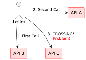
However, when the Tester (Top-Left) called API3 (Bottom-Right), the arrow crossed diagonally through the center of the screen, cutting through other API nodes or text (Crossing). Even using the ortho style couldn’t avoid this structural limitation.
Root Cause
Forcing a Star Topology interaction (Single Orchestrator communicating with multiple components) into a Grid structure inevitably led to crossed paths.
Solution: Iterative Optimization
Two structural approaches were evaluated to resolve this.
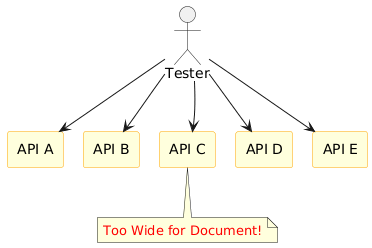
Iteration 1: Horizontal Star (Failed)
- Placed the Tester at the top and APIs in a row at the bottom.
- Result: Line crossing was solved, but with more than 4 APIs, it became extremely wide again (recurrence of Problem 2).
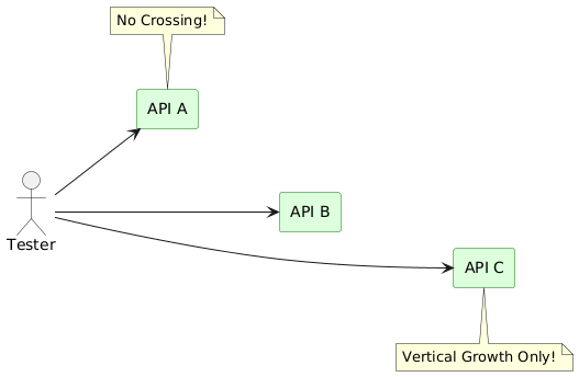
Iteration 2: Vertical Stack (Success)
- I flipped the layout 90 degrees.
- Left to Right Direction: Changed the flow from left to right.
- Vertical Stack: Stacked APIs vertically on the right.
@startuml
left to right direction          ' 1. Change flow to Left->Right

actor ":Tester" as tester
rectangle ":Update API" as update
rectangle ":Search API" as search

' 2. Force vertical alignment with Hidden Links
update -[hidden]down- search

' 3. Parallel relationships (No Crossing)
tester --> update
tester --> search
@enduml
Conclusion
Conclusion
The “Vertical Stack Layout” proved to be the optimal solution.
- Readability: The tall (Portrait) aspect ratio provides a clear and spacious view.
- Integrity: All arrows move horizontally in parallel, ensuring 0% line crossing.
- Scalability: The diagram grows vertically with added APIs, maintaining a constant, readable width.
Optimizing diagram layouts requires matching the topology to the information structure, rather than simply switching tools.
Key Takeaways
| Component | Optimization Strategy |
|---|---|
| Text Rendering | Apply skinparam maxMessageSize to force text wrapping and prevent excessive width. |
| Topology | Avoid Grid Layouts for 1:N (Orchestrator) relationships to eliminate line crossings. |
| Layout Direction | Use Vertical Stack (left to right direction + hidden link) for a scalable, readable structure. |